Showing posts with label first grade. Show all posts

Thursday, September 5, 2013

Piet Mondrian


Broadway Boogie Woogie, 1942-43
Piet Mondrian

(Thanks Liz, for sampling this lesson at our September meeting).

Supplies:
drawing paper
cardboard square templates (in the art cabinet)
sharpies or black crayon
primary colors - could use markers, pastels, non-diluted liquid watercolors

Slideshow: Here's a link to a great one on slideshare. There is a nice opportunity in here to review the concept of primary colors (red, yellow, blue). Give the kids a chance to focus on and discuss one of the images: what's going on in this picture? What do you see that makes you say that? What more can you find?

Using the black sharpie or crayon, have the kids use their square cardboard templates to create squares on their paper (they can overlap however they like...). Then have them use the primary colors to create their color design.

Variation: Kelli had the kids do a Mondrian-inspired design onto their portfolios, incorporating their names.

Monday, February 4, 2013

Jim Dine-inspired hearts

                                        
Gina Colbert did this beautiful Jim Dine-inspired heart project in second grade last week. It would be great for lots of different grade levels! Here's how she did it:

Materials:
watercolor paper
watercolors (pans) & brushes
chalk pastels
black construction paper
scissors
glue sticks

Set Up:
pass out watercolor pans, brushes, and one of each kind of paper to each child. Also, put 1 color of chalk pastel on every childs' desk. (they probably have glue sticks and scissors in their desk but you may want to check with teacher to be sure. you'll need these at the end for the last step).

Art History: 
To give them a little background on pop artist Jim Dine, you can use this powerpoint (made by Cheryl Collins) here. 

Project: 
1. have the kids make any kind of design they want on the watercolor paper using the watercolors. Just make sure they get the whole paper covered with color.
2. while that dries, have them pick up their piece of chalk and draw a square on their black paper. When they finish their square, have them pass the chalk to their neighbor on the right and draw another square with their new piece of chalk. Do this as many times as you need to until the black paper is covered with colorful squares.
3. have kids fold the black paper in half, and then draw half a heart shape. Cut and unfold to reveal the beautiful checkered heart.
4. glue heart on watercolor paper, voila a Jim Dine masterpiece!


Friday, September 14, 2012

Noticing Nature


I wanted to do a simple lesson with the Kindergartners that would give us an opportunity to talk about one of the most important skills an artist can have: the ability to notice the world.

supplies: a camera, a bunch of natural things (I used: white beans, split peas, berries off an ash tree, sticks, little nests, sunflower seeds, and figs because that's what I found/had- but you could use whatever)

prep: gather your supplies and divide them into containers. You'll be splitting the kids into small groups of 2 or 3, so make enough for each group (I used paper lunch bags to hold the supplies, and filled 11 bags).

Discussion: I had the kids close their eyes and think about things that are beautiful to them in nature - answers included an acorn, a pet cat with only one eye, and flowers. We talked about what it was about those things that made them beautiful. The acorn, for instance, was little (size). The cat was soft (texture) and imperfect (imperfect things can be even more special than perfect ones). The flowers were purple (colors). Then, we talked about how nature makes all kinds of patterns - giraffes, zebras, rows of leaves on a branch, etc. The kids had lots to say about this - many ideas. (**I meant to show them some pictures of Andy Goldsworthy installations, but forgot to push send on the email to the teacher! So I didn't use any visual aids and it was fine, but I think if I did it in another K class or 1st grade I'd totally show them pictures like this and more from the Andy Goldsworthy slideshow here:

Andy Goldsworthy, Elder Leaves, 1983
Activity: We went outside the classroom on a patch of cement, and I gave the paper bags with supplies to each small group with instructions to make a design that was interesting and beautiful to them. We talked about maybe incorporating patterns (ABABAB, ABBAABBA) and looking at how the different colors look next to each other.


(These guys above focused on making patterns inside the nest, look closely. For the photograph, which is the "art", they thought it would look neat to have all their hands shown.)


(This group used sticks to frame their nest, and then made piles by color around the nest. The diagonal stick across was a deliberate choice too.)

The last part - I took pictures of all the "installations." (Practical tip: I also made sure to get one picture of each with a piece of paper with names of group members so I can get copies of the pictures into the right portfolios. I would totally forget!)  
                                                       

Thursday, September 6, 2012

Van Gogh Sunflowers


Supplies: drawing paper, black sharpies, oil pastels, and if possible, a few sunflowers

Brief Background: Vincent Van Gogh was born in 1853 (over 150 years ago!). He was from the Netherlands, although he spent much of his adult life in France.

Van Gogh originally wanted to be a minister, because he cared much for other people and loved God. But he decided instead to become a painter. When he first started he was not very good and discouraged by his art teachers but he persevered, and worked incredibly hard. He loved painting with thick oil paint and he used bright, vivid colors to express himself -- he felt very deeply about many things. In the last ten years of his life he painted over 2,000 paintings. And although he only sold one painting while he was alive, now he is one of the most famous artists ever and his paintings are worth millions and millions of dollars and in museums all over the world.

{Depending on what grade you teaching this lesson to, you might want to add more to the discussion of Van Gogh. You can find great info here and here. Also, the Smart about Art book about Vincent Van Gogh should be in the art cabinet and if time permits, that's a great way to introduce the kids to the life of Van Gogh.}


Sunflowers: Van Gogh painted many pictures of sunflowers. Here are a few {see slideshare presentation here}. What do you notice about the color? How did Van Gogh apply the paint? Are the colors warm or cool? Do you like them?

If you have sunflowers - hold one up and have the kids help point out its parts: the long stem, the short plentiful petals and their pointy shape, the large dark center which is made up of lots of black seedy things, the green leaves which make a crown around the yellow petals.

On white drawing paper, have the kids draw five or six circles of varying sizes, roughly in the center. Once they've done this have them draw a smaller circle in the middle of each circle, then a simple vase shape, then a horizontal line across to indicate background. (I think it helps to do each step described together. You can do it on the board and they can follow.) Then have them add petals, and color in with oil pastel.

Variations:
-talk about the idea of warm/cool colors, and challenge the kids to make their flowers warm and backgrounds cool.

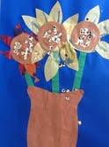
-a tissue paper alternative can be found here - I think Melanie's kids' version turned out really great. The picture is a bit fuzzy but those are sequins glued in the middle - which is super fun.


-have the kids cut out their flowers/vase and glue it onto decorative paper

Wednesday, September 5, 2012

Mondrian


Melanie did a fun lesson with a second-grade class about Piet Mondrian:

Supplies - white paper, sharpies, markers or oil pastels.

She gave them a brief lesson on Mondrian (here's a link to a simplified biography), and then had them draw black lines and then color them in using primary colors.

A tip from Melanie - limit the amount of lines they draw in order to finish on time.

Another variation on Mondrian, making Mondrian animals, can be found here.

Wednesday, February 8, 2012

Wayne Thiebaud


Wayne Thiebaud is one of the California greats - famous for his gentle paintings of beautifully arranged baked goods. This is a fun lesson for kids because it is so easy to relate to his happy art, and it's a stirring activity to imagine row upon row of delectable cookies, pies, cakes, donuts, etc. It's also easy to customize for different ages.

Materials: cardstock for template, scissors to cut the cardstock, large white paper, sharpies, and chalk pastels

Presentation: find slideshow here. Some simple facts about Mr. Thiebaud (pronounced "Tee-bo") are included in the slide presentation. Additionally you can read about his life here and here and share what seems relevant to you.


Activity: pass out cardstock squares and have the kids draw a shape of their choice with sharpie to be their template. Have them think of something sweet a la the paintings they saw in the slideshow - a lollipop, donut, cupcake, slice of pie, etc. {To do this in younger grades, you could have the templates already cut depending on the time you have - or even make copies of papers with the shapes already drawn, and skip to the coloring with chalk pastel step.} Then have the kids place the template on their white paper and outline their shape with sharpie. Have them repeat as they like on the page: show them how they can make rows, or whatever kind of pattern they like. Once the shapes are drawn, the children are to use the chalk pastels to fill in their shapes.

Tuesday, November 8, 2011

Native American Art

Looking for a great Thanksgiving activity? Leslie found this site with some really great activities, including making a coil clay cup, an owner stick, and masks. Check it out!

Tuesday, October 4, 2011

Chameleon Art


Liz did this fun drawing and color activity in the second grade, and reported that it was a huge hit with the kids. Looks so fun! The link to the original lesson on Deep Space Sparkle is here.
Materials:
watercolor paper
pan watercolors
brushes
pastels

Wednesday, November 11, 2009

Vincent Van Gogh: Starry Night


First Grade Art Lesson
Adapted with permission for use at George Kelly Elementary
from a lesson for Duniway Elementary by Michelle Smit

Principle: Abstract Art

Concept: Van Gogh suggested motion and direction in his paintings through the use of dramatic strokes of color.

Objective: Students will recreate Van Gogh's "Starry Night" using cut construction paper and gold paint.

Supplies: 1 11x14 inch sheet blue construction paper per student, construction paper scraps cut from various colors of paper (dark cool colors (black, purple, gray, blue) for houses, small scraps of bright warm colors for windows (yellow, orange, pink) ), scissors, glue, gold tempera paint, small dixie cups to hold the paint, and paint brushes

Pre-Class Prep: Make sure there are enough paper scraps in the colors you'll need.
Set-Up: Distribute paper, scissors, glue, paper towels, paint and brush to each student.

Art Appreciation Lesson: Summarize for the kids information about the interesting life of Vincent Van Gogh (great information here and here). Familiarize yourself with this beforehand so you can use your own words. Another idea is to read the kids a story about Van Gogh - like the biography in the Smart About Art series (book in the school art cabinet). This is a great way, if time permits, to give the kids a vivid glimpse into Van Gogh's life. Or, perhaps see if your teacher would mind reading it to the class the week before your lesson.

Power Point Presentation (slideshare link here):
1. This is a picture Van Gogh made of himself. What do you think - was he happy? Sad? Look how swirly he made the paint on the surface of the picture.
2. This is one of his most famous pictures, Starry Night. How does this make you feel? What do you think the weather feels like on this night? Do you notice how Van Gogh painted wind? Can you close your eyes, and imagine what wind, or cold, LOOKS like?
3. Van Gogh sometimes felt very, very sad and did strange things. He painted this picture of himself after he cut off his ear and mailed it to a woman he admired. This was a very bad idea!
4. Here is a picture of his bedroom that he painted. Would you like to live in this room?
5. Vincent Van Gogh painted this picture for his brother, Theo, and his wife after they had a little baby.
6. Van Gogh was worried that he was not a very good artist. In fact, he only sold one painting during his whole entire life. So he spent a lot of time practicing drawing. These are hands. He drew them over and over.
7. Here's another painting Van Gogh made of himself. Look at how he made his background - blue slashes of color. Does it make the picture feel calm? Busy? Do you like it?
8. If you look closely at this picture, you can see how much paint Van Gogh used to paint.

Activity:

Go back to slide #2, Starry Night.

Talk about the shapes in the sky and the way they represent motion. Show the children how to cut the paper scraps into the shape of little houses, churches, and buildings.

Do a quick demonstration of the instructions below, so the kids understand what they are supposed to do. (But don't be TOO detailed, because you don't want the kids to feel like they are supposed to copy you. Remember that the process of the art experience, rather than making one specific product, is the great thing about art for kids.)

Have students create the Starry Night village scene using shapes cut from the paper scraps. When they are ready, have them glue the shapes in a row along the lower edge of the dark background paper. Think houses, churches, trees, etc.

When they are completely finished gluing, have students paint stars in the night sky using the gold paint. For a Van Gogh style, they may paint dots of concentric circles around the stars, then add a second ring of dotted brush strokes around the first ring, moving out from the star into the sky. The stars will begin to look like their sparkles are spilling light into the night sky. Make as many rings around the stars and moon as desired.


Vocabulary: Concentric - circles within circles; silhouette - the dark shapes and outline of something against a lighter background.

Sunday, November 1, 2009

Funky Illuminated Fairy Tales

Little Red Riding Hood (1st grade example)

Fairy Horse (first grade example)

The Accident of Lily (3rd grade example)

(Based on this Getty Lesson; slideshare link for the presentation here)

*This could potentially take two lesson periods to complete.

Objective: To learn a bit about medieval illumination, and make an illuminated page, with picture and text, that reflects elements of illumination (fancy lettering, decorative background, etc.)

Supplies: Paper – large background paper, smaller paper cut into a rectangle with a curve at the top (see picture of finished product), and a still smaller piece of paper that the students can write their narrative paragraph on; pencils; colored pencils; and then some kind of gold to add “gold leaf” look to the work (perhaps glitter glue, if the classroom is not well set up for using gold tempera paint); glue sticks to glue all pieces of project together when finished; powerpoint presentation on Funky Fairy Tale Illumination.

Presentation:

PARAPHRASE the following information, which is taken directly from this great page on the Getty Museum website, about the making of manuscripts, illumination, and book binding:

(Slide 1)

“Most medieval manuscripts were written on specially treated animal skins, called parchment or vellum (paper did not become common in Europe until around 1450). The pelts were first soaked in a lime solution to loosen the fur, which was then removed. While wet on a stretcher, the skin was scraped using a knife with a curved blade. As the skin dried, the parchment maker adjusted the tension so that the skin remained taut. This cycle of scraping and stretching was repeated over several days until the desired thinness had been achieved. Here, the skin of a stillborn goat, prized for its smoothness, is stretched on a modern frame to illustrate the parchment making process.

(Slide 2)

After the surface had been prepared, the parchment was ruled, usually with leadpoint or colored ink. In this prayer book, you can see the ruling in red ink. Ruling lines helped the scribe to write evenly and were part of the design of the page. The scribe wrote with a quill pen made from the feather of a goose or swan. The end of the feather was cut to form the writing nib. A slit cut into the middle of the nib allowed the ink to flow smoothly to the tip of the pen. The appearance of the script—whether rounded or angular, dense or open—was partly dependent upon the shape and the angle of the nib.

Illumination, from the Latin illuminare, "to light up or illuminate," describes the glow created by the colors, especially gold and silver, used to embellish manuscripts. In making an illumination, the artist first made an outline drawing with leadpoint or quill and ink. Next, he or she painted the areas to receive gold leaf with a sticky substance such as bole (a refined red clay) or gum ammoniac (sap). The gold leaf was then laid down and burnished, or rubbed, to create a shiny surface, which sparkles as the pages are turned. Finally, the illuminator applied paints that were made from a wide variety of coloring agents: ground minerals, organic dyes extracted from plants, and chemically produced colorants. These pigments were usually mixed with egg white to form a kind of paint called tempera. The deep blue of this illumination was probably made from crushed stone, while the background is a solid mass of shining gold leaf.

(Slide 3)

Once the writing and illuminating had been completed, the parchment sheets were folded and nested into groups called gatherings. The gatherings were ordered in their proper sequence and sewn together onto cords or leather thongs that served as supports. Once the sewing was finished, the ends of the supports were laced through channels carved into the wooden boards that formed the front and back covers of the book. The binding was usually then covered in leather or a decorative fabric. This binding's most stunning ornamentations are the metal corner pieces and raised medallions that would protect the binding as it rested on a surface. The dyed parchment pieces inset into the central medallion were once brightly colored yellow, green, and blue, creating a stained-glass-window effect on the covers of the manuscript.”

Now the kids are going to make their own illuminated page. A couple of options, depending on time constraints, and what you and the teacher you are working with would like to do:

Option 1. Make a page from a Beastiary, which is a type of book, like an old-fashioned encyclopedia, featuring animals (some can be imaginary).

(see example – Fairy Horse)

Slides 4 and 5 are from a Beastiary made in England, around 1270.

Pass out the rectangle paper with curved top, and have students think of a favorite or imaginary animal to illustrate. Have them write a rough draft about their animal which includes information like where the animal lives, what it eats, drinks, etc., and any other peculiar tidbits which would make the writing interesting for them and their viewers. Once written, the students can then write their text around their drawing (glued to the larger piece of paper) in their best, most fancy writing. Perhaps they would even like to make the first letter of their writing sample extremely decorative, in the style of the illuminations they’ve seen. The final touch is for the students to add whatever kind of gold you can find: glitter glue, or gold tempera paint, depending on what’s ok with the teacher whose classroom you are using/working with.

Option 2: Think of a story – imagined or real – and illustrate it on the small rectangle paper with curved top.

(see examples: “The Accident of Lily” or “Little Red Riding Hood”)

Slides 6 and 7 show illustrated stories, taken from manuscripts made around 1400 in France.

Point out how the illustrations are bright and vivid, surrounded by beautiful decorations like vines or flowers, and the writing is fancy and carefully done.

Once the students have finished their picture, have them glue it onto a larger piece of paper.

At this point they should write a rough draft of the text they want to accompany their picture. Depending on age this could be just a title – or a short paragraph. When finished they should copy onto a smaller piece of paper in their best, most fancy writing, and finally add decoration to the borders of their larger paper. As a finishing touch they should add the gold in whatever form you have (glitter glue or gold tempera paint, depending on what’s ok with the teacher whose classroom you are using/working with.)

Thursday, October 15, 2009

Illuminated ABC-darium


Follow this link to the lesson on the Getty Museum's Education Website.

Additional background information on illumination you might like to use, in presenting the powerpoint slide show. Also please look at this link, and the information from the Funky Illuminated Fairy Tales Lesson.

We started our discussion by talking about how much we love books, and what a couple of our favorites are. What would life be like without books?

There was a time when only the very, very wealthy had access to any books, and they were extremely precious. Instead of paper, the book makers of the middle ages wrote on vellum, which is animal skin stretched very, very thinly. They made inks from berries and other dyes, and sometimes used precious metals like gold in the form of gold leaf (gold, pounded into a very thin layer). During this time many of the books produced were scripture stories from the Bible, written and illustrated by monks (who are men who worked for the Catholic church, and lived and worked together in monasteries, separate from villages). (Note the picture of this well-preserved monastery in Spain, in the slideshow).

Do you notice how fancy the backgrounds of the illustrations are? The monks often used designs from nature to decorate the main picture, or to embellish the large letter which started the story. Look at the letter B shown: do you see how the illustrator "hid" a picture inside the letter?

Also notice the beautiful handwriting the book-makers used. This is called calligraphy.


Kandinsky & The Color Wheel

Adapted for use at George Kelly Elementary by Lynne Millar, from a lesson by Patty

Principles: Learning the color wheel…complimentary colors, cool and warm colors, and how color affects the feel of a piece of art. Also learn about Wassily Kandinsky.

Obejective: Students will learn about the color wheel, and make a Kandinksy-inspired project using complimentary colors.

Supplies: (each student needs)

*glue stick

*scissors

*pencil

*large piece black construction paper

*scraps of colored construction paper: red, blue, yellow, green, purple, orange*circle

*templates for tracing – either circles of various sizes cut from chip board or poster board, or plastic lids. 5”, about 3”, and 1”

Pre-class Prep:

Make sure that you have enough paper scraps for each student to make 9 colored circles of varied sizes (they’ll get to cut out the shapes)

Set-Up:

Distribute a piece of large black construction paper, scissors, glue stick to each student. Every few children, place a pile of scrap colored construction paper for them to work with.

Art Appreciation Lesson:

Summarize for the kids information about the life of Wassily Kandinsky (see end of lesson for biographical information). Familiarize yourself with this beforehand so you can use your own words – but beware! Kandinsky’s modern style might be difficult to explain in much detail to first graders – so keep it short and sweet. In fact, the information provided within the Power Point presentation may be detail enough. It’s up to you.

Power Point Slide Presentation: (click here for link)

1. This is the color wheel. You can make most colors out of the three primary colors: blue, yellow, and red.

2. If you mix these colors together, you get secondary colors. Do you see how blue & yellow make green? And yellow and red make orange? Every color also has an opposite. Like green and red. When you put opposites next to each other, they make the other color look super bright.

3. Here’s a picture of Kandinsky. He was an artist who loved colors, and lived in a country called Russia – on the other side of the world.

4. He didn’t decide to become an artist until he was 30. When he first started painting, you could see things in the pictures he painted. For instance in this picture, what do you see? (clouds, buildings, people…)

5. As he got older, he decided he wanted to make his pictures a lot more abstract. That word means that they don’t really look “real”, or the way things look in a photograph. Instead the paintings are about color, and feeling, and shapes.

6. Do you like how all of these colors and shapes just pop out of the picture?

Activity Plan:

(note: the original lesson, see example picture, called for 6 circles in each size. This took forever! Unless you have super speedy cutters you might want to just have them do 3 of each size.)

Pass out the colored scrap paper and your largest circle template. Have the kids cut out 3 circles. They can use different colors, or the same, depending on what they want.

Then have them glue the circles onto their black paper, in two rows (see the example).

Now have them cut out 3 more circles, using the medium size circle. This time they’ll need to pay attention to their colors really closely – as the goal is for them to use opposite colors from the largest circles, so the colors really pop. When they’ve done this, they glue the circles onto the large ones.

Do the same with the smallest circles. Again, make sure they use contrasting colors! They don’t need to be exact opposites, just different enough so they don’t have yellow glued to yellow, etc.

Extra Background Information:

Wassily Kandinsky - 1866-1944

Born in Russia, Kandinsky spent much time as a child learning to play the cello and piano. Good at many things, he decided to train to be a teacher of law. In 1895 he saw on exhibit Monet's painting "The Haystack" and was upset by it, as he found it difficult to tell what the painter was trying to show in the picture and this was a radical way of making/seeing art for him.

The next year he left his teaching job and entered art school. His early art was expressionistic, much influenced by Henri Matisse, but in 1910 he saw an exhibit of Islamic art in Munich (Islamic art is highly decorative, and forbids the representation of human images), and that same year painted his first abstract painting.

In 1911 he formed a group with other abstract artists called The Blue Rider that exhibited widely through Europe and hugely influenced the direction of modern art. Among other members of the Blue Rider were Franz Marc and Paul Klee.

In 1933 the Nazis came into power. They considered abstract art to be degenerate and removed it from all museums. Kandinsky fled to Paris, where he spent the rest of his life.

Now Kandinsky is considered to be the father of abstract art in the 20th century.

Henri Matisse: Drawing with Scissors


First Grade Art Lesson

Adapted with permission for use at George Kelly Elementary by Lynne Millar from a lesson for Duniway Elementary by Michelle Smit

Principle: Color and Shape

Concept: Strong visual art can be created using cut paper and abstracted shapes to create rhythm, movement, balance and variety.

Objective: Students will create a paper cut-out collage (a drawing with scissors) that uses complimentary colors, shows repetition, and design through color, shape, and size.

Supplies:

*One 11x17-inch piece of colored construction paper per student

(have a variety of colors available)

*Construction paper scraps and rectangular scraps in strong, bold colors.

*Scissors

*Glue Sticks

*Color Wheel

Pre-Class Prep: None

Set-up:

*Set out a variety of 11x17-inch colored construction paper

*Have students choose one piece of colored construction paper

*Place piles of paper scraps and rectangular scraps of various sizes on each table

*Have glue sticks ready for distribution, but do not do so until each child has worked with the paper scraps.

Art Appreciation Lesson:

Summarize for the kids information about the interesting life of Henri Matisse – see end of the lesson for biographical information. Familiarize yourself with this beforehand so you can use your own words. Another idea is to read the kids a story about Henri Matisse: a great one is the biography of Matisse in the Smart About Art series (check with Lynne Millar if you would like to borrow this book). This is a great way, if time permits, to give the kids a vivid glimpse into Matisse’s life. Or – perhaps see if your teacher would like reading this book to the class in the week before the lesson.

Power Point Slide Presentation:

1T This is a photograph of Matisse.

2. Look at this painting Matisse made of his wife! Have you ever seen anyone wearing such an exciting hat? What color did Matisse paint her skin? Her neck?

When Matisse got older, he got really sick and had to stay in his bed. So he started making collages – pictures with paper and scissors – to make himself happy. He painted his own paper and drew shapes on the ceiling from his bed with a piece of charcoal connected to a long stick. He would also cut out the shapes and stick them to the wall.

3. This one is called The Sea. Do you see how the shapes in the front stand out? It’s because he made them all white, so they pop forward. How does this picture make you feel?

4. Here’s another cut out. It’s very simple, but very harmonious. Do you like it?

5. This one started out as a cut-out, but then Matisse turned it into stained glass window, for the wall of a church in France. Do you see how it’s a design about Christmas? Look how he uses opposite colors that make each other really pop out.

Activity:

Have the students cut out a large rectangle or use a rectangular scrap in a contrasting color and have them glue it down to the middle of their paper. Parents, please allow students to do this themselves. It’s better if it’s not a perfect rectangle. This will divide their background into three rectangular shapes creating a more interesting background. The colored stripe does not have to be exactly in the middle. The rectangle can be fat or thin. Their paper can be vertical or horizontal. They can use whatever color they want for the stripe, but dark colors seem to look the best. Then have the students use the scissors to cut out simple shapes with strong, bold colored construction paper found. Cut out a variety of sizes from small to large. Suggest pasting down a small square or rectangle of another color behind their cutouts to create more depth. Remind them to use complimentary colors whenever possible. Use curvilinear shapes in addition to straight ones.

Once the students have enough shapes to fill up their 11x17-inch paper, have the students arrange their shapes on the paper BEFORE passing out the glue.

Have the students glue their shapes to their paper.

Have them title their art and write this on a label and stick to the back of the paper.

Vocabulary:

Complimentary colors - colors that are opposite each other on the color wheel

Abstract Art – Creating art that is not a realistic image, but an imaginative, creative, expressive way to show the essence of something. (Kid Words: Weird, twisted, crazy, strange)

Curvilinear – A line that curves

Background Information: Henri Matisse - 1869-1954

Henri Matisse was born as the son of a grain merchant in the Picardy region of northern France. He studied law and worked as a law clerk. When Henri Matisse was 21 years old he became seriously ill. During the phase of convalescence Matisse started painting and discovered his love for art, which should become his life-long passion.

Two years later, in 1892, he gave up his career as a lawyer. He attended art classes at the Ecole des Beaux-Arts in Paris and dabbled in different styles. He then was influenced by the impressionist and post-impressionist painters Pisarro, Cezanne, van Gogh, Gauguin and Paul Signac and by the paintings of W. Turner.

Around the year 1905 he finally found his own style characterized by daring, bright colors executed in a broad brush stroke.

The Master of Colors

After an exhibition of their works in 1905 at the Salon d'Automne the group around Matisse and Andre Derain was ironically and pejoratively dubbed Les Fauves, which literally means The Wild Beasts.

From 1905 to 1906 Matisse painted one of his best paintings, The Joy of Life. It is considered to be one of the most important works of Twenty Century art and was bought by the famous art collector Dr. Albert C. Barnes. This painting and the whole Barnes collection was veiled from the public for 72 years. Finally the collection of the Barnes Foundation was opened to the art world again in 1993 and can be visited outside Philadelphia.

The American writer Gertrude Stein and her brother Leo were early collectors and supporters of Matisse paintings. Another admirer became Pablo Picasso with whom he exchanged paintings in 1907.

After World War I, Matisse had gained a high reputation and was an internationally recognized artist. In 1917 he left Paris and settled in Nice in the South of France where he remained until the end of his life. In 1925 he received the French Legion of Honor award.

The Late Years

In 1941 Matisse had an abdominal cancer surgery which had a devastating effect on his health and ability to paint. He was unable to stand upright in front of an easel. The artist therefore turned to another form of artistic expression. He created paper cut-outs in the same vivid, strong colors and daring compositions known from his paintings. He had an assistant and could work lying in bed or sitting comfortably in an arm-chair.

Henri Matisse died on November 3, 1954 in Nice as an internationally well known and highly reputable artist. He had continued creating paper cutout works until the day of his death. Pablo Picasso once said about the artist: "All things considered, there is only Matisse".

"I have always tried to hide my efforts and wished my works to have the light joyousness of springtime, which never lets anyone suspect the labors it has cost me."

"In modern art, it is undoubtedly to Cezanne that I owe the most."

"A colorist makes his presence known even in a single charcoal drawing."

"The essential thing is to spring forth, to express the bolt of lightning one senses upon contact with a thing. The function of the artist is not to translate an observation but to express the shock of the object on his nature; the shock, with the original reaction."

Article by Dieter Wanczura, from ww.artelino.com