Showing posts with label third grade. Show all posts

Thursday, September 5, 2013

Piet Mondrian


Broadway Boogie Woogie, 1942-43
Piet Mondrian

(Thanks Liz, for sampling this lesson at our September meeting).

Supplies:
drawing paper
cardboard square templates (in the art cabinet)
sharpies or black crayon
primary colors - could use markers, pastels, non-diluted liquid watercolors

Slideshow: Here's a link to a great one on slideshare. There is a nice opportunity in here to review the concept of primary colors (red, yellow, blue). Give the kids a chance to focus on and discuss one of the images: what's going on in this picture? What do you see that makes you say that? What more can you find?

Using the black sharpie or crayon, have the kids use their square cardboard templates to create squares on their paper (they can overlap however they like...). Then have them use the primary colors to create their color design.

Variation: Kelli had the kids do a Mondrian-inspired design onto their portfolios, incorporating their names.

Monday, February 4, 2013

Jim Dine-inspired hearts

                                        
Gina Colbert did this beautiful Jim Dine-inspired heart project in second grade last week. It would be great for lots of different grade levels! Here's how she did it:

Materials:
watercolor paper
watercolors (pans) & brushes
chalk pastels
black construction paper
scissors
glue sticks

Set Up:
pass out watercolor pans, brushes, and one of each kind of paper to each child. Also, put 1 color of chalk pastel on every childs' desk. (they probably have glue sticks and scissors in their desk but you may want to check with teacher to be sure. you'll need these at the end for the last step).

Art History: 
To give them a little background on pop artist Jim Dine, you can use this powerpoint (made by Cheryl Collins) here. 

Project: 
1. have the kids make any kind of design they want on the watercolor paper using the watercolors. Just make sure they get the whole paper covered with color.
2. while that dries, have them pick up their piece of chalk and draw a square on their black paper. When they finish their square, have them pass the chalk to their neighbor on the right and draw another square with their new piece of chalk. Do this as many times as you need to until the black paper is covered with colorful squares.
3. have kids fold the black paper in half, and then draw half a heart shape. Cut and unfold to reveal the beautiful checkered heart.
4. glue heart on watercolor paper, voila a Jim Dine masterpiece!


Thursday, September 6, 2012

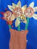
Van Gogh Sunflowers


Supplies: drawing paper, black sharpies, oil pastels, and if possible, a few sunflowers

Brief Background: Vincent Van Gogh was born in 1853 (over 150 years ago!). He was from the Netherlands, although he spent much of his adult life in France.

Van Gogh originally wanted to be a minister, because he cared much for other people and loved God. But he decided instead to become a painter. When he first started he was not very good and discouraged by his art teachers but he persevered, and worked incredibly hard. He loved painting with thick oil paint and he used bright, vivid colors to express himself -- he felt very deeply about many things. In the last ten years of his life he painted over 2,000 paintings. And although he only sold one painting while he was alive, now he is one of the most famous artists ever and his paintings are worth millions and millions of dollars and in museums all over the world.

{Depending on what grade you teaching this lesson to, you might want to add more to the discussion of Van Gogh. You can find great info here and here. Also, the Smart about Art book about Vincent Van Gogh should be in the art cabinet and if time permits, that's a great way to introduce the kids to the life of Van Gogh.}


Sunflowers: Van Gogh painted many pictures of sunflowers. Here are a few {see slideshare presentation here}. What do you notice about the color? How did Van Gogh apply the paint? Are the colors warm or cool? Do you like them?

If you have sunflowers - hold one up and have the kids help point out its parts: the long stem, the short plentiful petals and their pointy shape, the large dark center which is made up of lots of black seedy things, the green leaves which make a crown around the yellow petals.

On white drawing paper, have the kids draw five or six circles of varying sizes, roughly in the center. Once they've done this have them draw a smaller circle in the middle of each circle, then a simple vase shape, then a horizontal line across to indicate background. (I think it helps to do each step described together. You can do it on the board and they can follow.) Then have them add petals, and color in with oil pastel.

Variations:
-talk about the idea of warm/cool colors, and challenge the kids to make their flowers warm and backgrounds cool.

-a tissue paper alternative can be found here - I think Melanie's kids' version turned out really great. The picture is a bit fuzzy but those are sequins glued in the middle - which is super fun.


-have the kids cut out their flowers/vase and glue it onto decorative paper

Wednesday, September 5, 2012

Mondrian


Melanie did a fun lesson with a second-grade class about Piet Mondrian:

Supplies - white paper, sharpies, markers or oil pastels.

She gave them a brief lesson on Mondrian (here's a link to a simplified biography), and then had them draw black lines and then color them in using primary colors.

A tip from Melanie - limit the amount of lines they draw in order to finish on time.

Another variation on Mondrian, making Mondrian animals, can be found here.

Wednesday, February 8, 2012

Wayne Thiebaud


Wayne Thiebaud is one of the California greats - famous for his gentle paintings of beautifully arranged baked goods. This is a fun lesson for kids because it is so easy to relate to his happy art, and it's a stirring activity to imagine row upon row of delectable cookies, pies, cakes, donuts, etc. It's also easy to customize for different ages.

Materials: cardstock for template, scissors to cut the cardstock, large white paper, sharpies, and chalk pastels

Presentation: find slideshow here. Some simple facts about Mr. Thiebaud (pronounced "Tee-bo") are included in the slide presentation. Additionally you can read about his life here and here and share what seems relevant to you.


Activity: pass out cardstock squares and have the kids draw a shape of their choice with sharpie to be their template. Have them think of something sweet a la the paintings they saw in the slideshow - a lollipop, donut, cupcake, slice of pie, etc. {To do this in younger grades, you could have the templates already cut depending on the time you have - or even make copies of papers with the shapes already drawn, and skip to the coloring with chalk pastel step.} Then have the kids place the template on their white paper and outline their shape with sharpie. Have them repeat as they like on the page: show them how they can make rows, or whatever kind of pattern they like. Once the shapes are drawn, the children are to use the chalk pastels to fill in their shapes.

Tuesday, November 8, 2011

Native American Art

Looking for a great Thanksgiving activity? Leslie found this site with some really great activities, including making a coil clay cup, an owner stick, and masks. Check it out!

Tuesday, October 18, 2011

Charley Harper Bird Collages


Materials:
paper for background, newspaper, colored paper scraps, glue stick and scissors


Background Information:


"When I look at a wildlife or nature subject, I don’t see the feathers in the wings, I just count the wings. I see exciting shapes, color combinations, patterns, textures, fascinating behavior and endless possibilities for making interesting pictures. I regard the picture as an ecosystem in which all the elements are interrelated, interdependent, perfectly balanced, without trimming or unutilized parts; and herein lies the lure of painting; in a world of chaos, the picture is one small rectangle in which the artist can create an ordered universe." -Charley Harper

Charley Harper (1922-2007) lived in Ohio for most of his adult life, and was acclaimed for his simplified, graphic, and witty images of nature. Many of his beautiful pictures portrayed birds.

This lesson contrasts Harper's minimalist art with the more realistic paintings of James Audubon (1785 - 1851), whose life goal was to scientifically document through his paintings the birds of North America. Take a minute to read a little about Audubon before the lesson (here's a link to the wikipedia page on him). His life was super interesting, and worthwhile summarizing for the kids.

After giving the kids a little information about Harper and Audubon, show them the slide presentation (here's the link) and ask some open ended questions, like:

-compare the styles of the two artists: how are they similar? How are they different? (For lower grades, comparing these two styles is a great way to teach the concept of abstract vs. realistic art.)
-Look also at the backgrounds. How do the details in background, or the artist's decision to leave them out, affect the feel of a picture?
-Audubon was painting in a time before cameras. How do you think that affected the way he wanted to paint his pictures of birds?

-another idea to make it even more fun - when Gina did this, she printed out pictures of Harper and Audubon and taped them on the board. She had the kids match pictures she printed out of various paintings to the artist who did them. Fun!

Then take a minute to break down how to draw a really simple bird for the kids. I drew something along these lines on the board:


The project: Make a bird collage inspired by Charley Harper. Inspired by elementary school works from Mrs. Knight's Smartest Artists blog

Because our time was short (I only had 40 minutes to do this lesson), we left the background of our papers white and I actually really like the simplicity of the finished pictures. Very Harper-esque if you ask me. If you have more time, it could look amazing to have the kids do watercolor washes and collage on that, but you'd have to figure out how to get the papers dry enough for the glue sticks to work. (Maybe paint before the slideshow? I'm not sure if that would give you enough time...Let me know, anyone, if you try it this way).

Anyway: the first thing is to have the kids make their branches by tearing strips of newspaper and gluing them down. Remind the kids that branches come in all different shapes and sizes so they don't get too stressed about having their pictures look a certain way. Have them play around with branch placement. If some kids want to make nests instead of branches, great.

After the branches are glued down, they can start working on cutting their bird shapes out of the colored paper scraps and gluing them down, referencing the idea of breaking down the form of a bird into simple shapes like ovals, circles, triangles and rectangles. Possibilities to introduce to the kids could include using different colors of paper for layers,


adding in background elements like clouds and sun,


and thinking about different bird poses (this one is flying away. I love it!)

Friday, September 2, 2011

Teacher Portrait Lesson

(a fourth grade example)

(another fourth grade example)

(a second grade example)

(another second grade example)

This is a fun way to learn about facial proportion (and make a great teacher present at the same time, if you like). We begin by talking about the proportions of the human face. I draw an oval on the board, and then ask the kids where they think the eyes ought to go. Usually, they want to put them right at the top of the oval, where a forehead is. Call a child up (preferably a boy with little or very short hair!) and point out how actually the eyes are in the middle of ones' head.

On a piece of scratch paper have the kids draw an oval, then divide it in half horizontally and vertically. On the board you do the same, and then add in the eyes. Divide the space between the eyes and the chin in half horizontally, and add a nose (see drawing above). With your child model, point out then how the tops of the ears line up with the eyes, and then how the bottoms of the ears usually line up to the bottom of the nose - sketching them in like the drawing above.

Then, divide the space between the nose and chin in half horizontally, and add in the the mouth. Use your child model to show how the ends of the mouth line up with the middle of the eyes.

Once your practice drawing is made, give the kids a large piece of drawing paper and have them pencil in a large oval, and a light horizontal and vertical line to help them know where to put the facial features.

Now invite the teacher to the front of the class and have her be your model. Point out details like her hair color, if she is wearing earrings, her hair length, etc. Then have the kids go for it - first drawing with pencil and then adding color with pastel.

(Optional idea: while the kids are drawing, sneak around the class and ask the kids what they think is most beautiful about their teacher, and write it down. Then at the end of the lesson, take all of the pictures and instead of putting them in the kids' portfolios, make a book of them to give to the teacher, writing the quote from the child under their drawing. The collection of drawings makes a great class present in honor of the teacher's birthday, or teacher appreciation week.)


(first grade examples)

Friday, April 8, 2011

Blue Willow Pastel Painting

This is a fun project where you can talk a little about symmetry and design, that doesn't require complicated materials. Go here for the original lesson.

Other tidbits I discovered when researching willow ware:

-"Blue Willow" is an animated short film made by New Zealand filmaker Veialu Aila-Unsworth, based on the old chinese fairy tale of Blue Willow. (See the beautiful trailer here). Go here, if you'd like a link to a slideshow made from movie stills that you can use to tell the class the story.


-Art, if you are looking, is all over the place. Have any of you children ever seen a plate like this? Have you ever noticed the designs and decorations that are a part of the every day objects that you use? (Examples could be skateboards, quilts, fabric on cushions, clothing, etc.)

-The blue willow design was said to be used as secret propaganda - a way for the Hung society to defy the Manchu leaders who were in charge. The bad people in the story were a symbol for the bullying Manchus, but it took awhile for the Manchu leaders to notice that a story was being told and given that meaning on plates. Once they figured it out, it is claimed that they tried to destroy all of the dishes with this pattern, but somehow one got smuggled into England during the 1700's and the design became immortalized.
Art can be a powerful way for even weak and unrepresented people to have a voice in their societies.

Thursday, February 10, 2011

Winter Landscapes


Two gorgeous winter landscapes to draw inspiration from are Monet's Magpie, and John Henry Twachtman's american take, Winter Harmony (above).


Julie Cortinas directed us to this great lesson at our January art committee meeting. There are many variations of this to be found online; this one from Deep Space Sparkle is the one Julie and I both used. Here are some additional practical tips:

-slideshare presentation found here

-for art background, we discussed Monet's Magpie painting (see slideshow for visual). This link from the Musee d'Orsay, where the painting hangs, will give you a great overview of the painting and its reception in Paris when Monet painted it. (We also have a Smart About Art: Monet book in the art cabinet that you may want to read to the kids if time allows.)
-after we had a brief discussion about the inspiration, we discussed shadows. To help make this discussion more concrete, I brought along a flashlight and a stick. With the lights off, I shone the flashlight on the stick from different sides, making it really clear that a shadow falls on the opposite side of the light source. It's nice to point out to the kids that all of your shadows in a painting will usually fall the same direction (if you are trying to make a picture that is realistic rather than abstract).
-I was concerned that it was going to take a long time to distribute masking tape and that it would be difficult for kids to tear (I did this lesson for both second and fourth grade classes). It turned out not to be a problem - I walked around and taped a length of tape on the sides of everyone's desks (maybe 3 minutes); and all of the kids were able to tear the tape on their own.
-We sprinkled salt on the picture to create a snow-flaky texture (you can see this in the example above). I have since found out that using salt this way makes the picture not totally archival. Just FYI.
-I used the liquid watercolors - love them. Every desk had a little plastic bowl and I alternated water, blue paint, and purple paint (we kept the tones cool for winter) in the bowls for the kids to share, which worked fine. Just make sure and remind them to rinse their brush in the water bowl before changing colors - or it might be a better plan to keep the brushes with the colors.

VARIATION:
-instead of cool winter tones, use warm red, yellow, brown to make an autumn background if you are looking for a seasonal fall lesson. Maybe after the tape comes off the kids can use gold liquid watercolor to add a few gold leaves, still on the birch/aspen trees and on the ground (*send me a picture if you try this! I'll add it here!)

Wednesday, January 20, 2010

Family Fun Henri Matisse

I found this in February 2010's issue of Family Fun magazine and thought it might be a fun, low key project. Click on the picture for a larger image (which you can print), and if you need images for a slideshow presentation, click over to the George Kelly slideshare site and use the Matisse presentation. You can also find more information on the life of Matisse if you click on on this Matisse lesson link.

Monday, December 28, 2009

Saturday Evening Post


Norman Rockwell Lesson - by Cheryl Collins

AGENDA ~ROCKWELL

1. START MUSIC

2. INTRODUCE YOURSELF

3. SUPPLIES – NEED RULERS, PENCILS/COLORED, PASTELS AND LAP BOARDS (I have the colored paper)

4. POWERPOINT

a. Norman Rockwell ~ An American Artist

b. Rockwell born in New York – interested in art at an early age. He was not athletic like his brother, so he spent a lot of time drawing.( slide 2)

c. His parents saw that he had talent and signed him up for art lessons. At 18, he illustrated a handbook for the Boy Scouts of America(slide 3)

d. He began submitting drawings to The Saturday Evening Post( a publication first started by Benjamin Franklin) of which the accepted his , “Mother’s Day Off”. This began a long career. He painted pictures that told stories and were everyday life, many were humorous.(slide 4)

e. Norman Rockwell used live models for his paintings. He would show them the kind of expression he wanted them to exhibit. Then he would pay them $2 for posing. One time, another magazine offered him double his salary to come work for them. He turned them down and The Post doubled his salary for his loyalty. (slide 5)

f. Slide 6

g. In 1942, at the age of 48, he painted four pictures to illustrate the 4 freedoms. He tried to sell them to the government agencies, they rejected them. The post printed them and they became some of his most famous illustrations.

i. Freedom of speech- man standing speaking at town mtg

ii. Freedom to worship- shows people praying

iii. Freedom from want- show a family around the Thanksgiving table

iv. Freedom from fear- a couple tucking their children in bed slide (slide 7and 8)

h. In later years he drew pictures about National events such as civil rights and humanity. He drew less humorous drawings.(slide 9)

i. Slide 10

j. Slide 11 Our Project

i. First draw a picture you would like to see on the cover of the December issue of the Saturday Evening Post. IT CAN BE HOLIDAY OR SNOW RELATED OR MAYBE JUST WINTER.

ii. Center the picture on the paper. You can use pencil to start then color in with crayons.

iii. Last step is to draw the heading of the Saturday Evening Post. Use your white board as a ruler to draw the line below the Saturday Evening Post( See examples)

iv. How much do you think an issue would cost now?

v. Date

Sunday, November 1, 2009

Funky Illuminated Fairy Tales

Little Red Riding Hood (1st grade example)

Fairy Horse (first grade example)

The Accident of Lily (3rd grade example)

(Based on this Getty Lesson; slideshare link for the presentation here)

*This could potentially take two lesson periods to complete.

Objective: To learn a bit about medieval illumination, and make an illuminated page, with picture and text, that reflects elements of illumination (fancy lettering, decorative background, etc.)

Supplies: Paper – large background paper, smaller paper cut into a rectangle with a curve at the top (see picture of finished product), and a still smaller piece of paper that the students can write their narrative paragraph on; pencils; colored pencils; and then some kind of gold to add “gold leaf” look to the work (perhaps glitter glue, if the classroom is not well set up for using gold tempera paint); glue sticks to glue all pieces of project together when finished; powerpoint presentation on Funky Fairy Tale Illumination.

Presentation:

PARAPHRASE the following information, which is taken directly from this great page on the Getty Museum website, about the making of manuscripts, illumination, and book binding:

(Slide 1)

“Most medieval manuscripts were written on specially treated animal skins, called parchment or vellum (paper did not become common in Europe until around 1450). The pelts were first soaked in a lime solution to loosen the fur, which was then removed. While wet on a stretcher, the skin was scraped using a knife with a curved blade. As the skin dried, the parchment maker adjusted the tension so that the skin remained taut. This cycle of scraping and stretching was repeated over several days until the desired thinness had been achieved. Here, the skin of a stillborn goat, prized for its smoothness, is stretched on a modern frame to illustrate the parchment making process.

(Slide 2)

After the surface had been prepared, the parchment was ruled, usually with leadpoint or colored ink. In this prayer book, you can see the ruling in red ink. Ruling lines helped the scribe to write evenly and were part of the design of the page. The scribe wrote with a quill pen made from the feather of a goose or swan. The end of the feather was cut to form the writing nib. A slit cut into the middle of the nib allowed the ink to flow smoothly to the tip of the pen. The appearance of the script—whether rounded or angular, dense or open—was partly dependent upon the shape and the angle of the nib.

Illumination, from the Latin illuminare, "to light up or illuminate," describes the glow created by the colors, especially gold and silver, used to embellish manuscripts. In making an illumination, the artist first made an outline drawing with leadpoint or quill and ink. Next, he or she painted the areas to receive gold leaf with a sticky substance such as bole (a refined red clay) or gum ammoniac (sap). The gold leaf was then laid down and burnished, or rubbed, to create a shiny surface, which sparkles as the pages are turned. Finally, the illuminator applied paints that were made from a wide variety of coloring agents: ground minerals, organic dyes extracted from plants, and chemically produced colorants. These pigments were usually mixed with egg white to form a kind of paint called tempera. The deep blue of this illumination was probably made from crushed stone, while the background is a solid mass of shining gold leaf.

(Slide 3)

Once the writing and illuminating had been completed, the parchment sheets were folded and nested into groups called gatherings. The gatherings were ordered in their proper sequence and sewn together onto cords or leather thongs that served as supports. Once the sewing was finished, the ends of the supports were laced through channels carved into the wooden boards that formed the front and back covers of the book. The binding was usually then covered in leather or a decorative fabric. This binding's most stunning ornamentations are the metal corner pieces and raised medallions that would protect the binding as it rested on a surface. The dyed parchment pieces inset into the central medallion were once brightly colored yellow, green, and blue, creating a stained-glass-window effect on the covers of the manuscript.”

Now the kids are going to make their own illuminated page. A couple of options, depending on time constraints, and what you and the teacher you are working with would like to do:

Option 1. Make a page from a Beastiary, which is a type of book, like an old-fashioned encyclopedia, featuring animals (some can be imaginary).

(see example – Fairy Horse)

Slides 4 and 5 are from a Beastiary made in England, around 1270.

Pass out the rectangle paper with curved top, and have students think of a favorite or imaginary animal to illustrate. Have them write a rough draft about their animal which includes information like where the animal lives, what it eats, drinks, etc., and any other peculiar tidbits which would make the writing interesting for them and their viewers. Once written, the students can then write their text around their drawing (glued to the larger piece of paper) in their best, most fancy writing. Perhaps they would even like to make the first letter of their writing sample extremely decorative, in the style of the illuminations they’ve seen. The final touch is for the students to add whatever kind of gold you can find: glitter glue, or gold tempera paint, depending on what’s ok with the teacher whose classroom you are using/working with.

Option 2: Think of a story – imagined or real – and illustrate it on the small rectangle paper with curved top.

(see examples: “The Accident of Lily” or “Little Red Riding Hood”)

Slides 6 and 7 show illustrated stories, taken from manuscripts made around 1400 in France.

Point out how the illustrations are bright and vivid, surrounded by beautiful decorations like vines or flowers, and the writing is fancy and carefully done.

Once the students have finished their picture, have them glue it onto a larger piece of paper.

At this point they should write a rough draft of the text they want to accompany their picture. Depending on age this could be just a title – or a short paragraph. When finished they should copy onto a smaller piece of paper in their best, most fancy writing, and finally add decoration to the borders of their larger paper. As a finishing touch they should add the gold in whatever form you have (glitter glue or gold tempera paint, depending on what’s ok with the teacher whose classroom you are using/working with.)

Friday, October 16, 2009

Kandinsky & The Color Wheel


(This lesson is an expanded version of the first grade Kandinsky lesson, found here, but with richer background information. Follow the link to familiarize yourself with the basic lesson plan. Cheryl Collins, an art docent, developed the following presentation for older children, as well as the accompanying 3rd grade Kandinsky powerpoint. Thanks Cheryl!)

1. START MUSIC

2. INTRODUCE MYSELF

3. SUPPLIES – NEED GLUE STICK, PENCILS AND LAP BOARDS (I have the colored paper)

4. POWERPOINT

a. Color Wheel - Can make most colors out of the 3 primary colors ( slide 1)

b. Secondary Colors- Blue/yellow = green and red /yellow = orange (slide 2)

c. Every color has an opposite like green and red. When you put the opposites next to each other, you make the other color super bright.(Show green paper next to red)(slide 3)

d. Primary color painting(slide 4)There have been studies on how color can affect people…

e. Cool color painting(slide 5)Dr’s wear green in the operating room to rest their eyes from red.

f. Warm color painting(slide 6)Hospitals put depressed people into warm colored rooms to aid in making them feel better.

g. Kandinsky born(slide 7)

h. Kandinsky early years(slide 8)

i. Kandinsky at 30 (slide 9)

j. Kandinsky first painting(slide 10)

k. Kandinskly Blue Rider Group(slide 11)

l. Kandinsky 1913 picture bright and colorful(slide 12)

m. Kandinsky abstract (slide 13)

n. Kandinsky painting abstract(slide 14)from about 1910 Kandinsky transitioned to abstract . The figural elements were reduced and disappeared as the years went. He called his work impressions, compositions and improvisations.

o. Kandinsky quotes(slide 15)

p. Kandinsky Color Wheels(slide 16)

5. PROJECT

a. Everyone should have their pencil, glue stick and scissors.

b. Pass out plastic cups (share) and magnets circles/quarters

c. Pass out black paper

d. Pass out colored scraps

e. Everyone cut 6 large circles your (opposite) color choices - using the cup mouth to trace around (Trace on the corner or edge of the paper as you will need the rest of the paper for smaller circles.

f. Glue the circles in 2 rows across the paper.

g. Using the bottom of the cup trace 6 small circles in your choice of colors. What we want is contrasting colors- not the same.

h. Glue the medium size circles to the large ones using opposite colors.

i. Last use the small magnets to trace and glue onto the top of the medium circles. Use a contrasting color.(NO YELLOW TO YELLOW)